Welcome back to the most important piece of writing I have ever done and you have ever read. We are finally narrowing Sheffield United’s jersey’s down to the winner. We will start with four jerseys and have three head to head match-ups, only to find a winner. To start, we have the 1991/93 away jerseys versus the the 2017/18 home jersey.

What I love about these two kit’s are how classic soccer they are. To start with the 17/18 jersey, the three stripes on the shoulder from Adidas is subtle and adds to the quality of the jersey. The black and the dark red and pearly white go really well together, making the colors pop individually, but make each other stronger while they’re there. The blades shield stands out on the white stripe, unwavering and clearly showing what team it is.
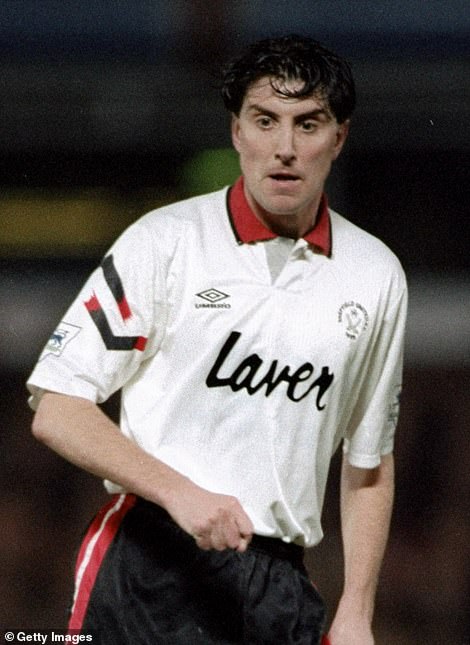
Now the 91/93 kit is a classic. When I think of retro jersey’s, I think of ones that are very similar to this. When I was a kid, I used to get Umbro apparel from my family across the pond, never really knowing what it was. Now being older, I know that it was a classic company in the soccer world. The red collar is very vintage too and definitely adds some class to the game. The black and red stripes adds a little subtle flair to the jersey, making it more distinguishable.
The two are both very proper jerseys. They each bring their own pro’s and con’s. What it comes down to is the one I would want to sport. In my opinion, the 2017/18 jersey is the one I would purchase and proudly wear. It will be moving on to the championship round.
In the other semi final round, we have the 1993-1995 away jerseys against the 2019/2020 home jerseys:
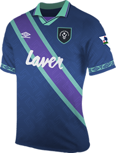
If this is your first Jersey Time that you’ve read, then you don’t know it, but the 1993 jersey has slithered its way to this point. I have never really liked it since the beginning, but it’s had very easy match-ups thus far. Previously I have said that I do like the color combination, but I don’t like how it’s not related to the Blades colors at all. The accent and font around the sleeves is very odd as well. Adding a weird extra spot for Umbro to advertise itself. I believe stand alone, it’s a nice jersey, but not the Sheffield United.
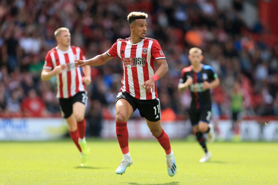
This past season’s kit is a classic. Adidas didn’t stray far from the past with this design and kept it simple, which isn’t a bad thing in this case. Simple red and white stripes with some slight black accent strongly supports Sheffields colors. I also mentioned last time how I even liked the advertisement on the front because it supports England in general and the home grown team that Sheffield United has created.
I believe I can easily say that the 2019/20 jersey takes this one without much trouble. But I think it’s incredible that the 1993 jersey has made it this far. That’s what’s fun about brackets, each round is different then the last, and match-ups are so important. But that whole ordeal is for another day.
FINALS: So, I believe it’s only fitting that we have two red and white stripped jerseys face off in the finals for Sheffield United. What I did not expect was that it would be two jerseys that are both from the past couple of seasons. The 2017/18 jersey is matched up with the 2019/20 jersey.
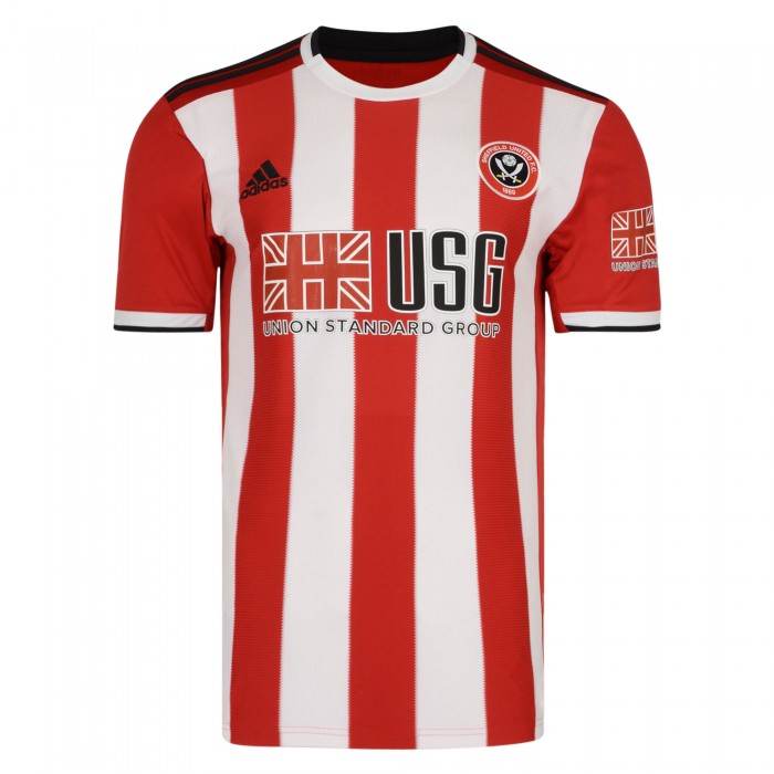
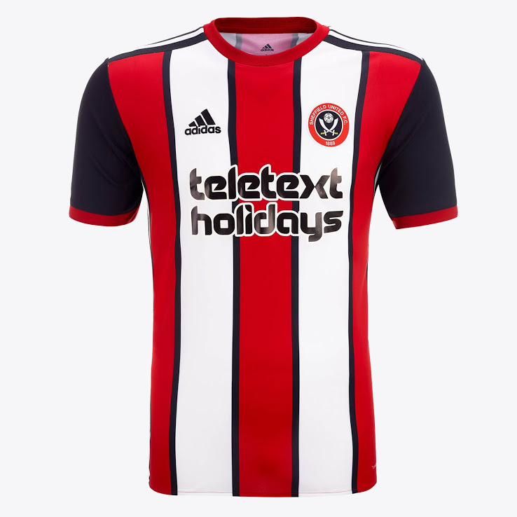
Both representing the same style and both created by Adidas, when you describe them on paper, they should look the same. But surprisingly, they both have very interesting features which sets them apart. The 17/18 jersey highlights the use of black way more than the 19/20. Separating each line down the middle with a black streak makes the red and white pop all the more. The black sleeves also helps bring out the black in the middle. The add serves no purpose and I don’t care for it at all. I don’t know what it is and frankly I don’t really care. The use of just red and white in the 19/20 makes the jersey bold. Only slightly accenting black in the tips of the jersey allows the main colors of the blades to take over. The simple design makes it elegant, even without a collar.
Although I like both jersey’s and would wear them both, I truly do like the 2017/18 jersey more then the 2019/20 jersey. For that reason, the 2017/18 jersey wins!
I believe that if I knew the significant meanings behind the jersey’s, meaning the seasons that happened while sporting the kits, that this contest would’ve ended differently. But solely based on looks, I believe that the combination of the red and white stripes with the black to support it does look the best.
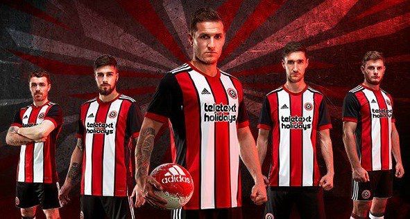
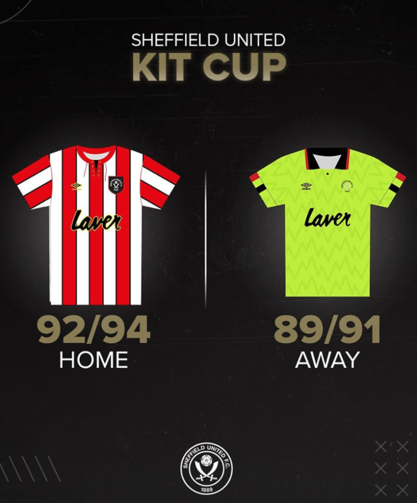
PSA: I also think it’s important to note that these two jerseys below were the finalists of the “Kit Cup” voting done on the Sheffield United twitter account. Highlighter yellow…….
