A few weeks back, SheffieldUnited put out their version of the Kit Cup, so I thought I would go through the list and pick out my favorites and my winner. Now although I have not been a fan for too long, and I know there is a lot of history in these jersey’s that I am not aware of, so I will just base this cup off of my opinion. I’m no style guru or anything like that, so it will literally just be my opinion.
I’m going to start from the top left and work my way down. Because there was a lot of kits, I’m going to do the whole first round in this post and the rest in a part 2.
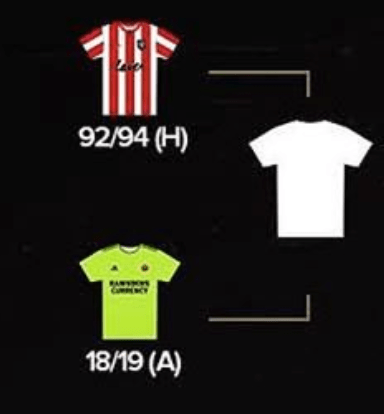
So the 92/94 home jersey versus the 18/19 Away jersey. This one is really lane and simple to me, and it’s based off of one reason and that’s I don’t like Neon. So the 92/94 jersey takes it easily. I mean neon just doesn’t make sense, your colors are red, white, and black. Where is highlighter yellow coming from.
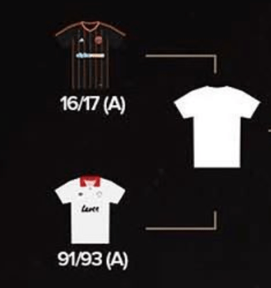
Now this is a much harder match up. Based on my four years at Marist college where our colors are only white and red, I feel that I’m deprived of black. I haven’t been able to wear black on game days ever and I think it’s just such a terrific color for jerseys. But for this specific kit, the 16/17 aways, I don’t love the orange stripes. It reminds me too much of Halloween. I think a red or white stripes would look a lot better. For the 91/93 option, I love the simplicity of it. Just white with a red color, it’s classy and simple. It does slightly remind me of a rugby uniform, but that doesn’t bother me too much. And for that reason, the 91/93 jersey wins this round for me.
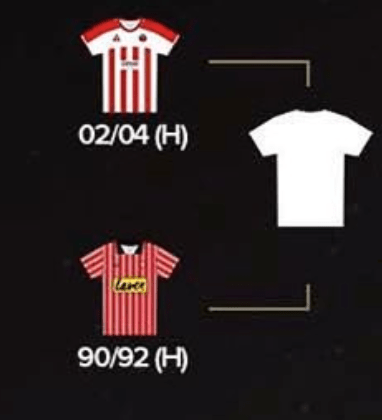
In the next round, it’s an 02/04 home matchup versus 90/92 home matchup. Both are red and white stripped which I do like for soccer kits. I do like the majority white and red on the 02/04 kit. I also think the 90/92 kit looks like a barbers shirt, as well one of the guys in an all mens Italian singing quartet. Which I don’t hate, but I just like the 02/04 kit more, so that’s the winner of this round.
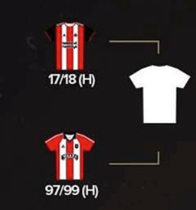
The 17/18 home and 97/99 matchup is very similar in style. Some would argue that they are the exact same other than the sleeves, one being black and one being red, and I would agree. Although the all red and white is classic, I like the black sleeves more. So the 17/18 homers win the last round of the left column.
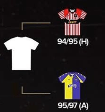
Heading up to the top right of the tournament. Although I really don’t love the 94/95 jersey, I think the 95/97 jersey is one of the uglier jerseys I’ve ever seen. It screams court jester and makes me laugh. Which laughing is a good thing if you are indeed a court jester, but not if you’re a small club trying to gain some respect in a professional soccer club. Easy dub for the 94/95 kit.
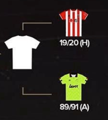
As previously mentioned, highlighter yellow will never win for me, so the 19/20 kit gets another easy win here. It seems like all the horrifying jersey’s have been put in the right column. (Because I’m late to the party and I know what people have voted for, the people chose a highlighter green kit over todays kits and I’m reconsidering my fandom. There must be some historical significance of 89/91)
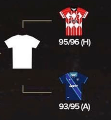
Although I do typically like teams sticking to their own colors, the 93/95 kit is miles better then the 95/96 kit, and not because of the 93/95 kit. The 95/96 kit is truly horrible. I have no idea what they were thinking and frankly I don’t want to talk about it anymore. The 90’s were a weird time man.
Because the next matchup was a choose your own adventure, I decided not to do that and see what the people voted for.
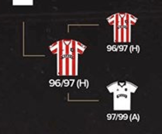
The people chose between another pair of 90’s kits. I don’t mind the picks themselves, but I disagree with the winner of the two. I also feel like I’ve picked enough red and white stripped kids in this tournament so I’m going for the all white kit, the 97/99 kit.
